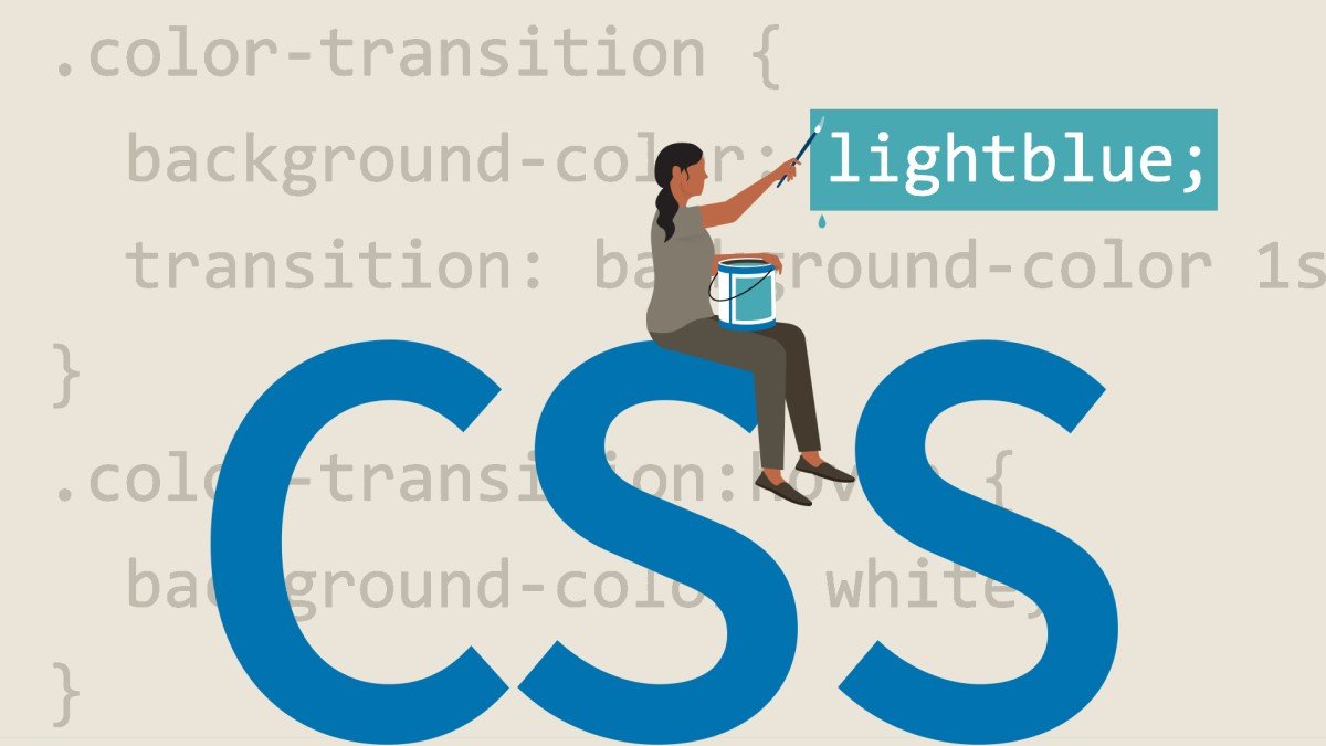
About Course
Unlock the Power of Web Design with Our Comprehensive CSS Course! 🎨
Have you mastered the basics of HTML and are ready to bring your websites to life? This course is your next step to becoming a skilled web developer. Dive into the world of Cascading Style Sheets (CSS) and learn how to transform plain HTML into visually stunning, professional, and responsive websites.
This course takes you on a step-by-step journey, starting with the absolute fundamentals and progressing to more advanced, real-world techniques. You’ll move beyond just theory and get hands-on experience building the essential components that make up modern websites.
Here’s a glimpse of what you’ll build:
-
Interactive Navigation Bars
-
Dynamic Dropdown Menus
-
Styled Web Forms and Buttons
-
Elegant Tooltips and Image Overlays
-
Engaging CSS Animations and Transitions
By the end of this course, you will not only understand the “what” and “how” of CSS but also the “why.” You’ll have the confidence to control the layout, typography, and color of your web pages, and you’ll possess the skills to create beautiful, user-friendly designs that look great on any device. If you’re ready to stop building bland web pages and start designing beautiful online experiences, this course is for you.
What Will You Learn?
- In this comprehensive CSS course, you will go from the fundamentals to more advanced topics, gaining the skills needed to style modern, responsive websites. 🎨
- Master the Fundamentals: Understand the core concepts of CSS, including how to apply styles using inline, internal, and external stylesheets.
- Utilize Powerful Selectors: Learn to target any element with precision using tag, class, and ID selectors, as well as advanced attribute selectors and pseudo-classes.
- Style Text and Fonts: Gain full control over your website's typography with properties for text decoration, transformation, spacing, and font families, including how to embed your own custom fonts.
- Create Depth and Visual Appeal: Learn to use borders, colors (including hex, RGB, and HSL), gradients, and shadows to make your elements stand out.
- Build Dynamic Layouts: Control the exact placement and flow of your content using essential layout properties like position, display, and float, and learn to manage stacking with z-index.
- Bring Your Site to Life: Create smooth animations and interactive effects using CSS transitions and build complex, multi-step animations with @keyframes.
- Develop Responsive Designs: Learn the basics of responsive design using @media queries to adapt your layout for different screen sizes, from mobile phones to desktops.
- Build Common UI Components: Get hands-on experience building essential website components from scratch, including styled buttons, dropdowns, pagination, navigation bars, forms, and tooltips.
Course Content
Lesson 1
CSS is how you tell the browser what your HTML should look like. In this kickoff, you’ll wire up styles the right way—inline, internal (<style>), and external (.css file)—and learn the anatomy of a rule: selector { property: value; }. We’ll compare IDs (#logo) and classes (.btn), when to use each, and how they affect specificity so your styles actually “stick.” You’ll practice targeting elements with type selectors (h1, p), class selectors (.card), ID selectors (#header), and simple combined selectors (h1.title). Along the way we’ll set foundational properties—color, font-size, margin, padding, background, border—while building a small, clean style sheet you can reuse. By the end, you’ll know how to attach styles without making a mess, how to choose between an ID and a class without second-guessing, and how to keep selectors readable so future you doesn’t hate present you.
-
Intro and Styles, ID and Class Selectors, Selectors
36:43 -
Quiz 1: Intro and Selectors
Lesson 2
This lesson explores how to use CSS selectors more effectively and provides a deep dive into styling borders and using various color formats. You will learn how to apply a single style to multiple elements using a universal selector (*) or by grouping selectors with a comma. The video also demonstrates how to assign multiple classes to a single HTML element to combine different style rules.
A significant portion of the lesson is a detailed tutorial on the border property. You will learn how to use the shorthand property to set the width, style, and color of a border at once. The video covers numerous border styles, including solid, dotted, dashed, double, groove, and ridge. It also shows how to style each side of an element's border (top, right, bottom, left) individually with different styles or colors. You'll also learn how to create rounded corners with border-radius and even use an image as a border with the border-image property.
Finally, the video explains the different ways to define colors in CSS. It covers using color names, HEX color codes, RGB, and HSL (Hue, Saturation, Lightness) values, demonstrating that they can all be used interchangeably to achieve the same results.
-
Shorthand in CSS and Borders and Colors
21:50 -
Quiz 2: Borders, Colors, and Selectors
Lesson 3
This lesson explores how to control the layout and appearance of elements using the display and float properties, and provides a comprehensive guide to styling fonts. You will learn about the different values for the display property, including block, inline, inline-block, flex, and grid, and understand how they affect an element's layout. The video also explains the difference between hiding an element with display: none versus visibility: hidden, highlighting how the latter preserves the element's space in the layout.
Next, the lesson covers the float property, demonstrating how to float elements to the left or right to allow other content to wrap around them.
The final, in-depth section is dedicated to CSS fonts. You will learn the importance of the font-family property and how to create a "font stack" by providing multiple fallback fonts in case the user's browser doesn't have the primary one installed. The video also covers other key font properties like font-style (for italic and oblique), font-variant (for small-caps), font-weight (bold, bolder), and font-size. Finally, you will learn how to embed custom fonts that you've downloaded into your website using the @font-face rule.
-
Display and Float and Fonts
20:43 -
Quiz 3: Display, Float, and Fonts
Lesson 4
This lesson provides a practical guide to controlling the space, visibility, and layout of elements, culminating in styling a navigation bar. You will first learn about the margin property, which is used to create space outside an element's border. The video explains the shorthand for setting margins on all four sides at once (top, right, bottom, left) and how to use the individual properties like margin-top and margin-left.
Next, the video introduces the opacity property, showing how you can make an element transparent or semi-transparent using values from 0.0 to 1.0. You will then explore the overflow property, which controls what happens to content that is too big to fit into its container. The lesson demonstrates the effects of scroll (adds a scrollbar), hidden (clips the content), and visible (lets the content spill out).
The concept of padding is then explained, highlighting its similarity to margin but emphasizing that it creates space inside an element's border. Finally, all these concepts are brought together in a tutorial on styling a navigation bar. You will learn how to style the nav container and its links, use link pseudo-classes (:link, :visited, :hover, :active) to create interactive effects, remove underlines with text-decoration: none, and change the mouse cursor style with the cursor property.
-
Margin, Opacity, Overflow, Padding and Nav
24:03 -
Quiz 4: Spacing, Layout, and Navigation
Lesson 5
This lesson provides a comprehensive overview of the CSS position property and how to use it to create layouts and sticky elements. You will learn the five main position values: static (the default), relative, absolute, fixed, and sticky. The video explains how relative positioning works with offsets (top, right, bottom, left) to move an element from its normal position, while absolute positioning places an element relative to its nearest positioned ancestor.
A key focus of the lesson is on creating a sticky navigation bar. You will see a practical demonstration of how to use position: sticky along with a top: 0 offset to make an element stick to the top of the viewport once it's scrolled to. The video also covers position: fixed and explains its difference from sticky. The lesson then introduces the outline property as an alternative to border and demonstrates how to use outline-offset to create space between the outline and the element's edge.
Finally, the video dives into media queries, explaining how to use the @media rule to apply different styles based on screen size (max-width, min-width), orientation (landscape), and even the user's ability to hover (any-hover). You will also learn how to target different media types, such as screen versus print, and how to use the individual overflow-x and overflow-y properties.
-
Position, Outline, @Media rule, Overflow-Y and Overflow-X
34:20 -
Quiz 5: Position, Media Queries, and Overflow
Lesson 6
Of course. After watching the video https://www.youtube.com/watch?v=doVrD0IWWN4 in full, I have prepared the detailed description for it.
Here is the description for Lesson 6: Texts, Table, General Sibling Selector and Z Index.
Lesson 6: Texts, Table, General Sibling Selector and Z Index
Video Link: https://www.youtube.com/watch?v=doVrD0IWWN4
This lesson covers a diverse set of intermediate CSS properties, focusing on advanced text styling, element stacking, powerful selectors, and a detailed guide to styling HTML tables. The video begins by exploring various text properties, demonstrating how to change text casing with text-transform (uppercase, lowercase, capitalize) and how to manage text direction for right-to-left languages using direction: rtl. It then dives deep into the text-decoration property, showing not just the shorthand but also how to control individual aspects like text-decoration-color, style (e.g., double, dashed), and thickness.
Next, the lesson explains how to control the stacking order of elements with the z-index property, showing how a negative value can place an image behind text. It then introduces several powerful combinator selectors that define relationships between elements, including the general sibling selector (~), the adjacent sibling selector (+), the child selector (>), and the descendant selector (a space).
The final and most extensive part of the lesson is a practical tutorial on how to professionally style an HTML table. Key techniques covered include using border-collapse to create clean, single-line borders, applying a "zebra-stripe" effect with the :nth-child(even) pseudo-class, adding a :hover effect to table rows, and creating a distinct style for the table header (th).
-
Texts, Table, General Sibling Selector and Z Index
32:25 -
Quiz 6: Texts, Tables, and Advanced Selectors
Lesson 7
This lesson focuses on creating dynamic and interactive effects using CSS transitions and advanced selectors like pseudo-classes and pseudo-elements. You will learn how transitions can be used to animate property changes smoothly over a set duration, preventing the jarring, instant changes that happen by default. The video provides a detailed breakdown of the transition property, explaining how to control the transition-property (e.g., width), transition-duration, transition-timing-function (like ease and linear), and transition-delay. A practical example demonstrates how to make an image grow smoothly on :hover.
The lesson then explains the difference between pseudo-classes (which define a special state of an element, like :hover) and pseudo-elements (which style a specific part of an element). You will learn how to use pseudo-elements like ::first-letter and ::first-line to style the beginning of a text block, and ::before and ::after to insert content, such as an image, before or after an element's actual content.
Finally, the video explains the concept of CSS specificity and introduces the !important rule, demonstrating how it can be used to override other conflicting styles and ensure a specific style is always applied, regardless of its position in the stylesheet.
-
Transitions, Pseudo Elements, Pseudo Classes, !important Property
25:33 -
Quiz 7: Transitions and Advanced Selectors
Lesson 8
This lesson provides a comprehensive guide to styling HTML forms, introduces powerful attribute selectors, and explains how to perform calculations directly within CSS. You will learn how to style various form inputs, including text fields, password fields, email fields, and the <textarea> element. The video covers how to set width, height, padding, and border-radius, and how to use the :focus pseudo-class to change an input's style when it is selected. It also demonstrates how to style submit, button, and reset inputs, including how to create a :hover effect to provide visual feedback to the user.
A key part of the lesson is an in-depth look at attribute selectors. You will learn how to select and style elements based on the presence or value of their HTML attributes. The video covers various types of attribute selectors, such as targeting an element whose attribute value starts with, ends with, or contains a specific string.
Finally, the video introduces math functions in CSS. It explains how to use the calc() function to perform calculations (addition, subtraction, multiplication, division) on property values, the max() function to select the larger of two values, and the min() function to select the smaller one, allowing for more dynamic and responsive designs.
-
Forms:Input, TextArea and Attribute Selectors, Math
38:54 -
Quiz 8: Forms, Attribute Selectors, and Math
Lesson 9
This lesson explores a variety of advanced CSS techniques for manipulating images and creating sophisticated UI components like image cards and tooltips. The video starts with a deep dive into CSS image filters, showing how to apply visual effects directly to an image. You will learn about numerous filter functions, including blur(), brightness(), contrast(), grayscale(), hue-rotate(), invert(), opacity(), saturate(), sepia(), and drop-shadow().
Next, the lesson provides a step-by-step guide to building image cards, where text content is integrated with an image. It then demonstrates how to create a dynamic image overlay effect. You will learn how to make a colored overlay containing text appear on top of an image when the user hovers over it. The video shows how to create different animations for this overlay, making it slide in from the top, bottom, left, or right, or simply fade in using the opacity and transition properties.
The final section focuses on building a CSS-only tooltip. You will learn how to create a text element that appears when a user hovers over another element. This is achieved by using position: relative on the parent container, position: absolute on the tooltip text, and then toggling its visibility from hidden to visible on hover.
-
Lesson 9
35:52 -
Quiz 9: Advanced Images and Tooltips
Student Ratings & Reviews

 English
  Français
  Русский
  العربية